A while ago, I built my very first Chrome web extension, ‘Belgian Train Station‘.
I felt like playing around with Javascript for a bit again. Building a basic extension that solved a small problem seemed the perfect way to do that!
Let me give you an overview of the project.
The problem
To be honest, there is no real big problem at hand here. In Belgium, where I live, the national railway company is called NMBS. This company, like any other self-respecting national railway company, has their own website where you can perform searches to plan your journey. However, it seems like there is no real good overview available to view time tables for arriving and/or departing trains for a specific train station.
iRail does have something like that, however, the displayed information is very concise (they call it ‘Liveboard’).
Looking at iRail’s solution, I noticed that they use a free and publicly available API. So I read through their documentation.
The solution
I had only a few requirements;
- add translations in the country’s 3 official languages (Dutch, French and German) as well as English
- keep it simple
- show all relevant data for departures and arrivals.
A simple Chrome extension such as this one only really needs one basic index.html. So I created one that merely contains all the necessary skeleton and references to the stylesheet and scripts.
The index.html:
<!DOCTYPE html>
<html lang="en">
<head>
    <meta charset="UTF-8">
    <title>Belgian Train Station</title>

    <link rel="stylesheet" href="styles.css">
    <script src="utils.js"></script>
    <script src="dataService.js"></script>
    <script src="popup.js"></script>
</head>
<body>
<h1 id="titleHeader">Belgian Train Station</h1>

<div id="clock">
    <span id="hours"></span>
    :
    <span id="minutes"></span>
    :
    <span id="seconds"></span>
</div>

<div id="inputContainer">
    <div>
        <label id="movementTypeLabel" for="movementType" class="formLabel">Movement type</label>
        <select id="movementType" name="movementType"></select>
    </div>
    <div>
        <label id="stationNameLabel" for="stationName" class="formLabel">Station name</label>
        <input id="stationName" name="stationName" type="search">
        <button id="clearSearch" hidden="hidden">Clear</button>
    </div>
</div>

<div id="loader" class="loading-state">
    <div class="loading-black"></div>
    <div class="loading-yellow"></div>
    <div class="loading-red"></div>
</div>

<div id="liveBoardContainer">
    <div id="liveBoard"></div>
</div>

<br>
<a id="donationLink" href="https://www.buymeacoffee.com/Thibstars" target="_blank" tabindex="-1"><img src="https://cdn.buymeacoffee.com/buttons/v2/default-yellow.png" alt="Buy Me A Coffee" style="height: 45px !important;width: 180px !important;" ></a>
<br>
<a id="version" target="_blank" aria-label="Version"></a>
<div id="themeInputContainer">
    <label id="themeLabel" for="theme" class="formLabel"></label>
    <select id="theme" name="theme"></select>
</div>
</body>
</html>
I structured the JS code into 3 main scripts: dataService.js, utils.js and popup.js.
The first one would house all code related to fetching data via the iRail API, the second one would hold any common utilities I deemed useful, the popup script is meant to contain all displaying logic.dataService.js
const API_REQUEST_INIT =         {
  headers: {
    'user-agent': 'Belgian Train Station (https://github.com/Thibstars/belgian-train-station-chrome)',
    'Access-Control-Allow-Origin': '*',
    'Access-Control-Allow-Methods': 'GET, POST, PATCH, PUT, DELETE, OPTIONS',
    'Access-Control-Allow-Headers': 'Origin, Content-Type, X-Auth-Token'
  }
};

const API_BASE_URL = 'https://api.irail.be';

const SUPPORTED_API_LANGUAGES = ['en', 'nl', 'de', 'fr'];

const MOVEMENT_TYPE = {
  DEPARTURE: Symbol.for('departure'),
  ARRIVAL: Symbol.for('arrival')
}

function determineAPILanguageFromUILocale(i18n) {
  const uiLanguage = getMessage(i18n, '@@ui_locale').substring(0, 2); // Only interested in the 2 first chars

  return SUPPORTED_API_LANGUAGES.includes(uiLanguage) ? uiLanguage : 'en'; // Get matching lang or default to en
}

async function getRandomStation(i18n) {
  const response = await fetch(
      API_BASE_URL + '/stations/?format=json&lang=' + determineAPILanguageFromUILocale(i18n),
      API_REQUEST_INIT
  );
  const data = await response.json();

  const stations = data.station;

  return stations[Math.floor(Math.random() * stations.length)];
}

async function getLiveBoard(i18n, stationName, movementType) {
  let movement;

  switch (movementType) {
    case MOVEMENT_TYPE.DEPARTURE:
      movement = Symbol.keyFor(MOVEMENT_TYPE.DEPARTURE);
      break;
    case MOVEMENT_TYPE.ARRIVAL:
      movement = Symbol.keyFor(MOVEMENT_TYPE.ARRIVAL);
      break
    default:
      movement = Symbol.keyFor(MOVEMENT_TYPE.DEPARTURE);
  }

  const response = await fetch(
      API_BASE_URL + '/liveboard/?station=' + stationName + '&format=json&lang=' + determineAPILanguageFromUILocale(i18n) + '&arrdep=' + movement,
      API_REQUEST_INIT
  );

  return await response.json();
}
utils.js
// Use this method to avoid inspection warnings on i18n's getMessage method
function getMessage(i18n, key) {
  let result = key;
  if (i18n) {
    // noinspection JSUnresolvedReference
    result = i18n.getMessage(key) ? i18n.getMessage(key) : key;
  }

  return result;
}

// Use this method to avoid inspection warnings on chrome's runtime.getManifest method
function getManifest() {
  // noinspection JSUnresolvedReference
  return chrome.runtime.getManifest();
}

function storeValueInGlobalStorage(key, value) {
  // noinspection JSUnresolvedReference
  return chrome.storage.sync.set({[key]: value});
}

function getValueFromGlobalStorage(key) {
  // noinspection JSUnresolvedReference
  return chrome.storage.sync.get([key]);
}
popup.js
const THEME = {
  LIGHT: Symbol.for('light'),
  DARK: Symbol.for('dark'),
  HIGH_CONTRAST: Symbol.for('high_contrast'),
};

let liveBoardRefreshTimer;
const LIVE_BOARD_REFRESH_INTERVAL = 60 * 1000;

async function loadLiveBoardForStation(i18n, stationName, movementType) {
  const liveBoard = document.getElementById('liveBoard');
  liveBoard.setAttribute('data-movement-type', Symbol.keyFor(movementType));
  const clearSearch = document.getElementById('clearSearch');
  clearSearch.hidden = false;
  removeStationDataClarifierIfPresent();

  liveBoard.replaceChildren(document.createTextNode(getMessage(i18n, 'fetchingData') + stationName));

  showLoader();

  return getLiveBoard(i18n, stationName, movementType);
}

function removeStationDataClarifierIfPresent() {
  const stationDataClarifier = document.getElementById('stationDataClarifier');
  if (stationDataClarifier) {
    stationDataClarifier.remove();
  }
}

function showLoader() {
  const loader = document.getElementById('loader');
  loader.setAttribute('class', 'loading-state');
  loader.children[0].hidden = false;
  loader.children[1].hidden = false;
  loader.children[2].hidden = false;
}

function hideLoader() {
  const loader = document.getElementById('loader');
  loader.removeAttribute('class');
  loader.children[0].hidden = 'hidden';
  loader.children[1].hidden = 'hidden';
  loader.children[2].hidden = 'hidden';
}

function createMovementTable(liveBoard, i18n, stationName, movements) {
  const movementsTable = document.createElement('table');
  movementsTable.id = 'liveBoardTable';
  movementsTable.setAttribute('data-station-name', stationName);
  const headerRow = document.createElement('tr');
  const thCanceled = document.createElement('th');
  thCanceled.replaceChildren(document.createTextNode(getMessage(i18n, 'canceled')));
  const thDelay = document.createElement('th');
  thDelay.title = getMessage(i18n, 'delayTitle');
  thDelay.replaceChildren(document.createTextNode(getMessage(i18n, 'delay')));
  const thPlatform = document.createElement('th');
  thPlatform.replaceChildren(document.createTextNode(getMessage(i18n, 'platform')));
  const thStation = document.createElement('th');
  thStation.replaceChildren(document.createTextNode(getMessage(i18n, 'station')));
  const thTime = document.createElement('th');
  thTime.replaceChildren(document.createTextNode(getMessage(i18n, 'time')));
  headerRow.replaceChildren(
      thCanceled,
      thDelay,
      thPlatform,
      thStation,
      thTime,
  );
  movementsTable.replaceChildren(headerRow);

  for (const movement of movements) {
    const delayInMinutes = movement.delay / 60;
    const time = new Date(movement.time * 1000);
    const isCanceled = movement.canceled !== '0';
    const isDelayed = delayInMinutes > 0;
    const isUnknownPlatform = movement.platform === '?';

    const trMovement = document.createElement('tr');
    movementsTable.appendChild(trMovement);

    const tdCanceled = document.createElement('td');
    tdCanceled.className = isCanceled ? 'canceled' : '';
    tdCanceled.title = isCanceled ? getMessage(i18n, 'trainCanceled') : '';
    tdCanceled.replaceChildren(document.createTextNode(!isCanceled ? getMessage(i18n, 'no') : getMessage(i18n, 'yes')));
    const tdDelay = document.createElement('td');
    tdDelay.className = isDelayed ? 'delayed' : '';
    tdDelay.replaceChildren(document.createTextNode(isDelayed ? delayInMinutes.toString() : '-'));
    const tdPlatform = document.createElement('td');
    tdPlatform.className = isUnknownPlatform ? 'unknownPlatform' : '';
    tdPlatform.title = isUnknownPlatform ? getMessage(i18n, 'unknownPlatform') : '';
    tdPlatform.replaceChildren(document.createTextNode(movement.platform));
    const tdStation = document.createElement('td');
    tdStation.className = 'clickableCell';
    tdStation.replaceChildren(document.createTextNode(movement.station));
    const loadAndShowLiveBoard = () => {
      const selectedStationName = tdStation.innerText;

      let movementType = getSelectedMovementType()

      loadLiveBoardForStation(i18n, selectedStationName, movementType).then(
          (data) => {
            showLiveBoard(i18n, selectedStationName, data, liveBoard);
            document.getElementById('stationName').value = selectedStationName;
          }
      ).catch(
          () => {
            showNoResults(liveBoard, i18n, selectedStationName);
          }
      );
    }
    tdStation.onclick = function () {
      clearInterval(liveBoardRefreshTimer);
      loadAndShowLiveBoard();
      liveBoardRefreshTimer = setInterval(loadAndShowLiveBoard, LIVE_BOARD_REFRESH_INTERVAL);
    };
    const tdTime = document.createElement('td');
    tdTime.title = time.toLocaleString();
    tdTime.replaceChildren(document.createTextNode(time.toLocaleTimeString()));
    trMovement.replaceChildren(
        tdCanceled,
        tdDelay,
        tdPlatform,
        tdStation,
        tdTime,
    );
  }

  return movementsTable;
}

function setStaticMessages(i18n) {
  const title = getMessage(i18n, 'extensionName');
  document.title = title;
  document.getElementById('titleHeader').innerText = title;

  document.getElementById('themeLabel').innerText = getMessage(i18n, 'theme');

  document.getElementById('movementTypeLabel').innerText = getMessage(i18n, 'movementType');

  document.getElementById('movementType').title = getMessage(i18n, 'movementTypeHelp');

  document.getElementById('stationNameLabel').innerText = getMessage(i18n, 'stationName');

  document.getElementById('stationName').title = getMessage(i18n, 'stationNameHelp');

  document.getElementById('clearSearch').innerText = getMessage(i18n, 'clear');
}

function showLiveBoard(i18n, stationName, data, liveBoard) {
  const movementType = Symbol.for(liveBoard.getAttribute('data-movement-type'));

  let movements = document.createElement('div');
  movements.id = 'movements';
  const numberSpan = document.createElement('span');
  numberSpan.id = 'movementAmount';
  let movementData;

  switch (movementType) {
    case MOVEMENT_TYPE.DEPARTURE:
      movements.replaceChildren(
          document.createTextNode(getMessage(i18n, 'departures')),
          numberSpan
      );
      numberSpan.innerText = data.departures.number;
      movementData = data.departures.departure;
      break;
    case MOVEMENT_TYPE.ARRIVAL:
      movements.replaceChildren(
          document.createTextNode(getMessage(i18n, 'arrivals')),
          numberSpan
      );
      numberSpan.innerText = data.arrivals.number;

      movementData = data.arrivals.arrival;
      break
    default:
      movements.replaceChildren(
          document.createTextNode(getMessage(i18n, 'departures')),
          numberSpan
      );
      numberSpan.innerText = data.departures.number;
      movementData = data.departures.departure;
  }

  const movementTable = createMovementTable(liveBoard, i18n, stationName, movementData);

  const lastUpdated = document.createElement('span');
  lastUpdated.innerText = getMessage(i18n, 'lastUpdated') + ': ' + new Date().toLocaleTimeString();

  liveBoard.replaceChildren(
      movements,
      document.createElement('br'),
      movementTable,
      lastUpdated
  );

  hideLoader();
}

function showNoResults(liveBoard, i18n, stationName) {
  liveBoard.replaceChildren(document.createTextNode(getMessage(i18n, 'noResults') + stationName));

  hideLoader();
}

function showStationDataClarifier(clearSearch, i18n) {
  clearSearch.hidden = 'hidden';
  const stationName = document.getElementById('liveBoardTable').getAttribute('data-station-name');
  const stationDataClarifier = document.createElement('span');
  stationDataClarifier.setAttribute('id', 'stationDataClarifier')
  stationDataClarifier.innerText = getMessage(i18n, 'stationDataClarification') + ' ' + stationName;
  const liveBoardContainer = document.getElementById('liveBoardContainer');
  liveBoardContainer.insertBefore(stationDataClarifier, liveBoardContainer.children[0]);
}

function getSelectedMovementType() {
  const movementTypeSelect = document.getElementById('movementType');

  switch (Symbol.for(movementTypeSelect.value.toLowerCase())) {
    case MOVEMENT_TYPE.DEPARTURE :
      return MOVEMENT_TYPE.DEPARTURE;
    case MOVEMENT_TYPE.ARRIVAL :
      return MOVEMENT_TYPE.ARRIVAL;
    default:
      return MOVEMENT_TYPE.DEPARTURE;
  }
}

function switchThemes(theme, animateTransition) {
  document.documentElement.setAttribute('data-theme', theme);
  if (animateTransition) {
    document.documentElement.classList.add('color-theme-in-transition');
    window.setTimeout(function () {
      document.documentElement.classList.remove('color-theme-in-transition')
    }, 1000);
  }
}

function showClock() {
  const clock = document.getElementById('clock');
  const hours = document.getElementById('hours');
  const minutes = document.getElementById('minutes');
  const seconds = document.getElementById('seconds');

  showTime(clock, hours, minutes, seconds);

  setInterval(() => {
        showTime(clock, hours, minutes, seconds);
      },
      1000
  );
}

function showTime(clock, hours, minutes, seconds) {
  const date = new Date();
  if (!clock.matches(':hover')) {
    // Do not constantly update the tooltip while showing it (it will flash)
    clock.title = date.toLocaleString();
  }
  hours.innerText = date.getHours().toString().padStart(2, "0");
  minutes.innerText = date.getMinutes().toString().padStart(2, "0");
  seconds.innerText = date.getSeconds().toString().padStart(2, "0");
}

document.addEventListener('DOMContentLoaded', function () {
  getValueFromGlobalStorage('theme').then((result) => {
    const themeToUse = result.theme ? result.theme : 'light';
    document.getElementById('theme').value = themeToUse.toUpperCase();
    switchThemes(themeToUse, false);
  });

  const loader = document.getElementById('loader');
  loader.removeAttribute('class');
  loader.children[0].hidden = 'hidden';
  loader.children[1].hidden = 'hidden';
  loader.children[2].hidden = 'hidden';

  // noinspection JSUnresolvedReference
  const i18n = chrome.i18n;
  setStaticMessages(i18n);
  showClock();

  const themeSelect = document.getElementById('theme');
  for (let theme in THEME) {
    const option = document.createElement('option');
    option.value = theme;
    option.innerText = getMessage(i18n, 'theme_' + theme);
    themeSelect.appendChild(option);
  }

  const movementTypeSelect = document.getElementById('movementType');
  movementTypeSelect.replaceChildren();
  for (let key in MOVEMENT_TYPE) {
    const option = document.createElement('option');
    option.value = key;
    option.innerText = getMessage(i18n, 'movementType_' + key);
    movementTypeSelect.appendChild(option);
  }

  const stationNameInput = document.getElementById('stationName');
  getRandomStation(i18n).then((randomStation) => {
    stationNameInput.placeholder = randomStation.name;
  }).catch(() => {
    stationNameInput.placeholder = '';
  });

  const manifestData = getManifest();
  const versionLink = document.getElementById('version');
  const version = manifestData.version;
  versionLink.innerText = getMessage(i18n, 'version') + ' ' + version;
  versionLink.setAttribute('href', 'https://github.com/Thibstars/belgian-train-station-chrome/releases/tag/' + version);
  versionLink.title = getMessage(i18n, 'release');

  const clearSearch = document.getElementById('clearSearch');
  clearSearch.hidden = 'hidden';
  clearSearch.addEventListener('click', function () {
    document.getElementById('liveBoard').replaceChildren();
    stationNameInput.value = '';
    clearSearch.hidden = 'hidden'

    getRandomStation(i18n).then(
        (randomStation) => {
          stationNameInput.placeholder = randomStation.name;
        }
    ).catch(() => {
      stationNameInput.placeholder = '';
    });
  });

  let typingTimer;
  stationNameInput.addEventListener('input', function () {
    clearTimeout(typingTimer);
    typingTimer = setTimeout(() => {
      clearInterval(liveBoardRefreshTimer);
      const loadAndShowLiveBoard = () => {
        if (stationNameInput.value) {
          let movementType = getSelectedMovementType();

          const liveBoard = document.getElementById('liveBoard');
          loadLiveBoardForStation(i18n, stationNameInput.value, movementType).then(
              (data) => {
                showLiveBoard(i18n, stationNameInput.value, data, liveBoard);
              }
          ).catch(
              () => {
                showNoResults(liveBoard, i18n, stationNameInput.value);
              }
          );
        } else {
          showStationDataClarifier(clearSearch, i18n);
        }
      };
      loadAndShowLiveBoard();
      liveBoardRefreshTimer = setInterval(loadAndShowLiveBoard, LIVE_BOARD_REFRESH_INTERVAL);
    }, 500);
  });

  themeSelect.addEventListener('change', () => {
    const selectedTheme = themeSelect.value.toLowerCase();

    storeValueInGlobalStorage('theme', selectedTheme);

    return switchThemes(selectedTheme, true);
  })

  movementTypeSelect.addEventListener('change', () => {
    const liveBoard = document.getElementById('liveBoard');
    const liveBoardTable = document.getElementById('liveBoardTable');

    clearInterval(liveBoardRefreshTimer);
    const loadAndShowLiveBoard = () => {
      if (liveBoardTable) {
        const stationName = liveBoardTable.getAttribute('data-station-name');
        if (stationName) {
          const stationDataClarifier = document.getElementById('stationDataClarifier');

          loadLiveBoardForStation(i18n, stationName, getSelectedMovementType()).then(
              (data) => {
                showLiveBoard(i18n, stationName, data, liveBoard);
                if (stationDataClarifier) {
                  showStationDataClarifier(clearSearch, i18n);
                }
              }
          ).catch(
              () => {
                showNoResults(liveBoard, i18n, stationName);
              }
          );
        }
      }
    };
    loadAndShowLiveBoard();
    liveBoardRefreshTimer = setInterval(loadAndShowLiveBoard, LIVE_BOARD_REFRESH_INTERVAL);
  });

}, false);
Now for the translations! This is a cornerstone feature of the application, as in Belgium, localisation is always important (3 national languages!).
Getting messages can be done like so:
getMessage(i18n, 'departures')
where ‘departures’ represents a translation key. For each language we need a directory (‘en’ for English for example) containing a messages.json file.
That file contains a simple JSON structure containing all the translation keys and there actual value. So in the case of the ‘departures’ example, such a pair would look like this:
"departures": {
  "message": "Departures",
  "description": "Label for the amount of departures."
}
After having implemented the above, a manifest.json file is required to glue it all together and to provide some packaging details:
{
  "name": "Belgian Train Station",
  "description": "Get updates for a Belgian train station.",
  "version": "1.1.3",
  "manifest_version": 3,
  "action": {
    "default_popup": "index.html",
    "default_icon": "icon.png"
  },
  "default_locale": "en",
  "icons": {
    "48": "icon.png"
  },
  "host_permissions": ["https://api.irail.be/*"],
  "permissions": ["storage"],
  "author": "Thibault Helsmoortel"
}
How it works
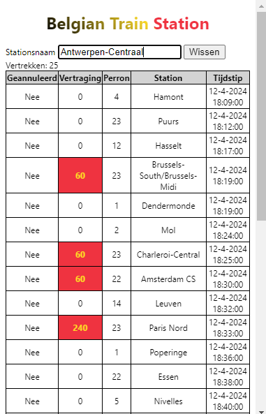
Easy! After installation, just open the extension by clicking on the icon. A popup will appear. You can then select wether you’d like to view departures or arrivals and enter the name of the train station you want to view the live data for. That’s it! No more need for a quick Google. There is a official NMBS app, but they don’t offer a view like this one.
For the rest, I’ll leave you with the magic of experiencing the little tool yourself.
I do hope you’ll enjoy the theme (light/dark) mechanism and the automatic language detection. The code is open-source, so feel free to report any issues or contribute to the project. I’m sure there is room for improvement (I’m thinking of a station selection view for example).
Happy travelling and train spotting!
Find the project on GitHub.
Find the loading animations on CodePen.